
A comprehensive journey through the Bill Pay process
I started by reviewing other payment solutions both inside and outside the healthcare industry to identify best practices. I found the most competitors' payment products featured a simple user interface (UI), clear instructions, and used the least amount of steps possible.

My next step was to gather quantitative, discovery research through the use of an online survey. Most of my questions involved validating the findings from my competitive analysis, for example asking about their previous experiences making healthcare payments online and what types of pain points the commonly encounter.
Unfortunately, I wasn't unable to recruit actual Phreesia patients for the survey due to concerns from our Privacy team and this was before my company had procured an online research tool. Instead, I posted on online communities, like Nextdoor, Craigslist, and Facebook, to recruit survey participants, noting the potential bias for tech-savvy user in my documentation.
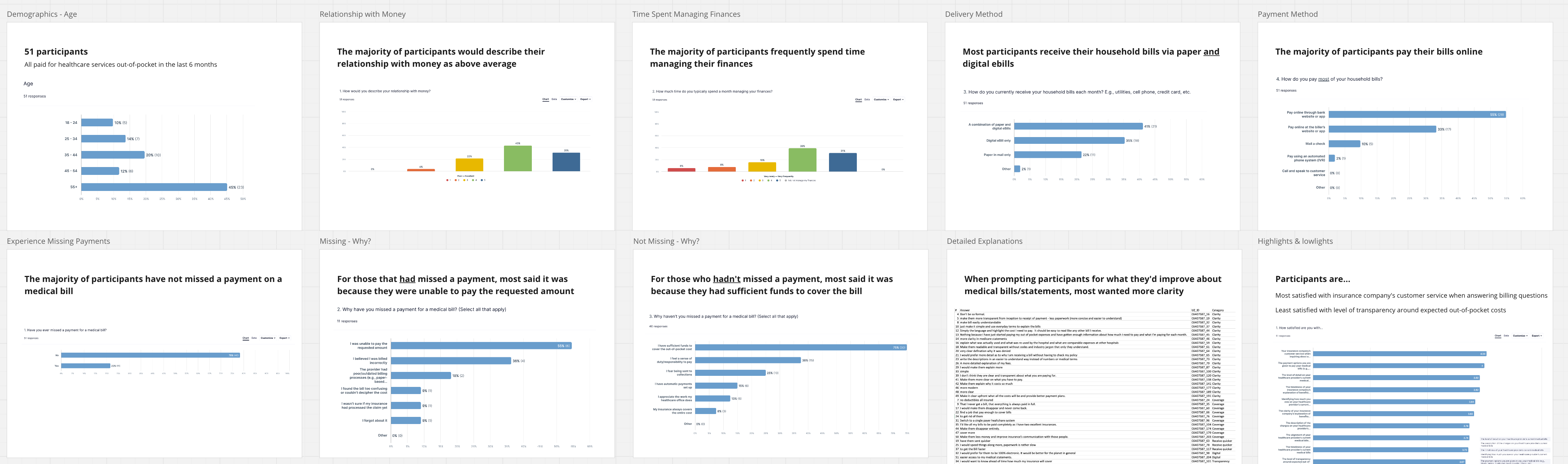
Once I started seeing themes in the survey, I began developing an interview plan to further probe into my findings so far. Again, I recruited participants from online communities and met with them on Zoom for an hour. Though my interview sample size was small (six participants), I gained a lot of knowledge about their experiences with confusing charge descriptions and manual payment requirements.
Personally, I don't often use personas in projects, but I started to see three categories of users emerge from my research. I knew that personas would be the best way to communicate these user groups with my product manager and engineering team. I defined the personas as:
I purposefully kept the personas low-fidelity (text-only, no demographic information, or imagery) since we were still in the early stages of the project.
From here, I facilitated a workshop with the team to generate a learn UX canvas. This helped us define the business problem to solve rather than a solution to implement. We then dissected the business problem into our core assumptions. This allowed us to build out hypotheses to test our riskiest hypotheses before jumping into design and development.

From here, I partnered with my product manager to sketch out a rough concept of our main pages. I kept the concepts extremely low-fidelity to help convey the flow of the website, rather than the aesthetic. We used these wireframes to communicate with the development team and get further buy-in from leadership.

Next I created a quick prototype to quickly gut check the direction we were headed in with real users. Overall, participant's feedback was positive. We were able to catch a couple potential problem areas before moving too far into the design phase.
I continued to revise the design, increasing the fidelity slowly with each round of testing until we saw participants regularly completing tasks successfully.
.png)
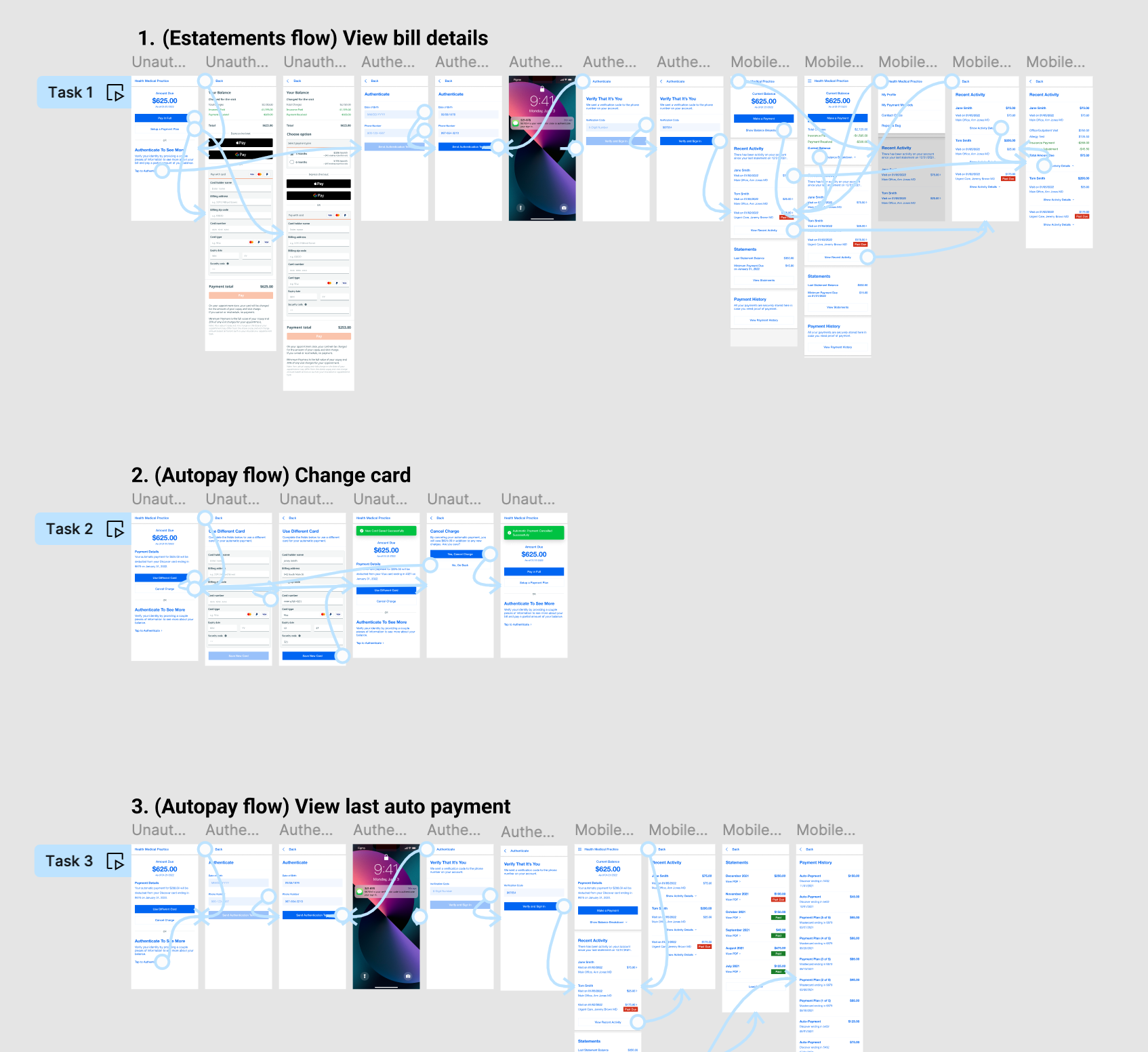
Developers were involved periodically throughout the design process via design reviews and planning user stories. However, when the MVP design was finalized, I created a page within the Figma document for the devs to reference. The page featured with final mockups with prototypes and annotations to explain key interactions.
Go back to the Bill Pay case study