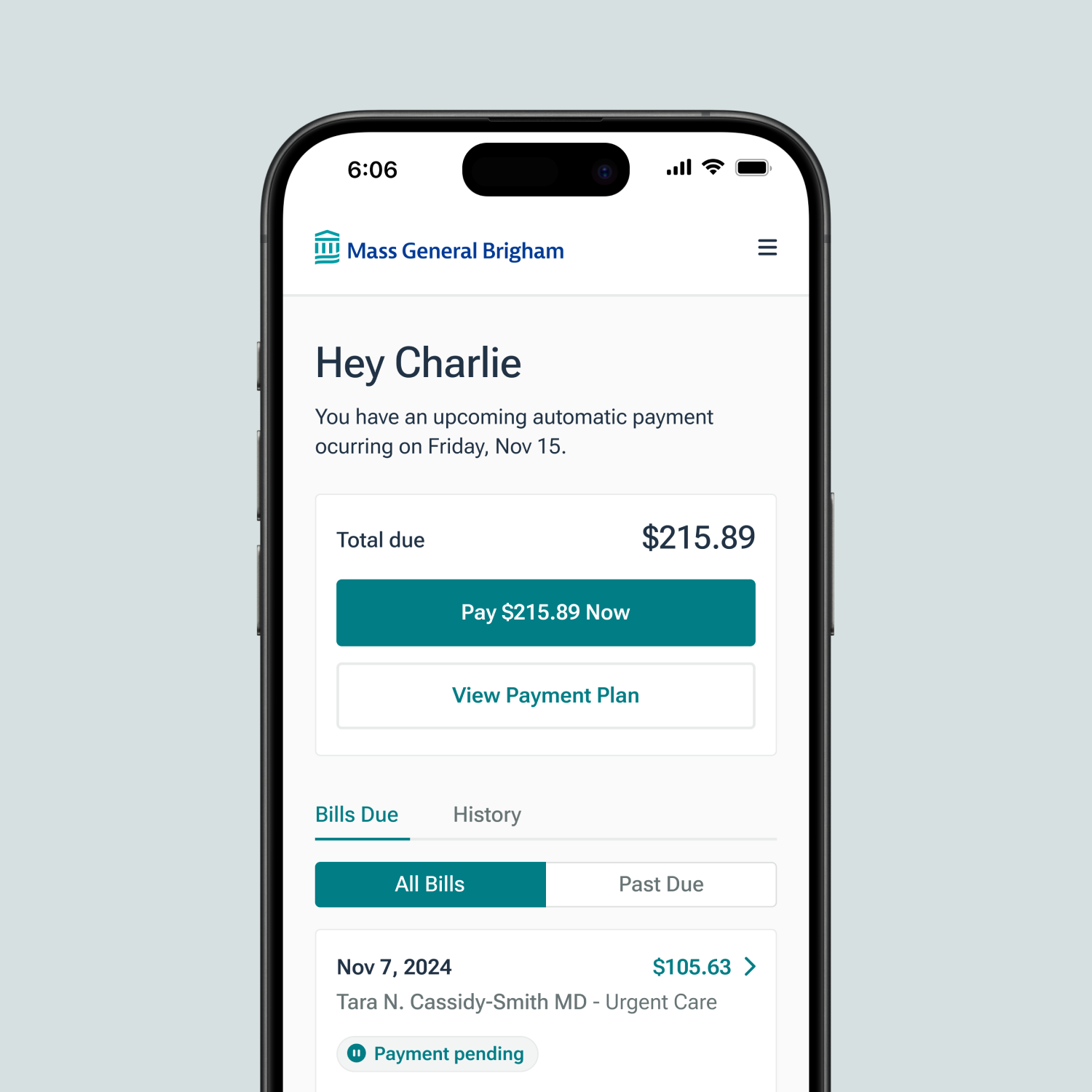
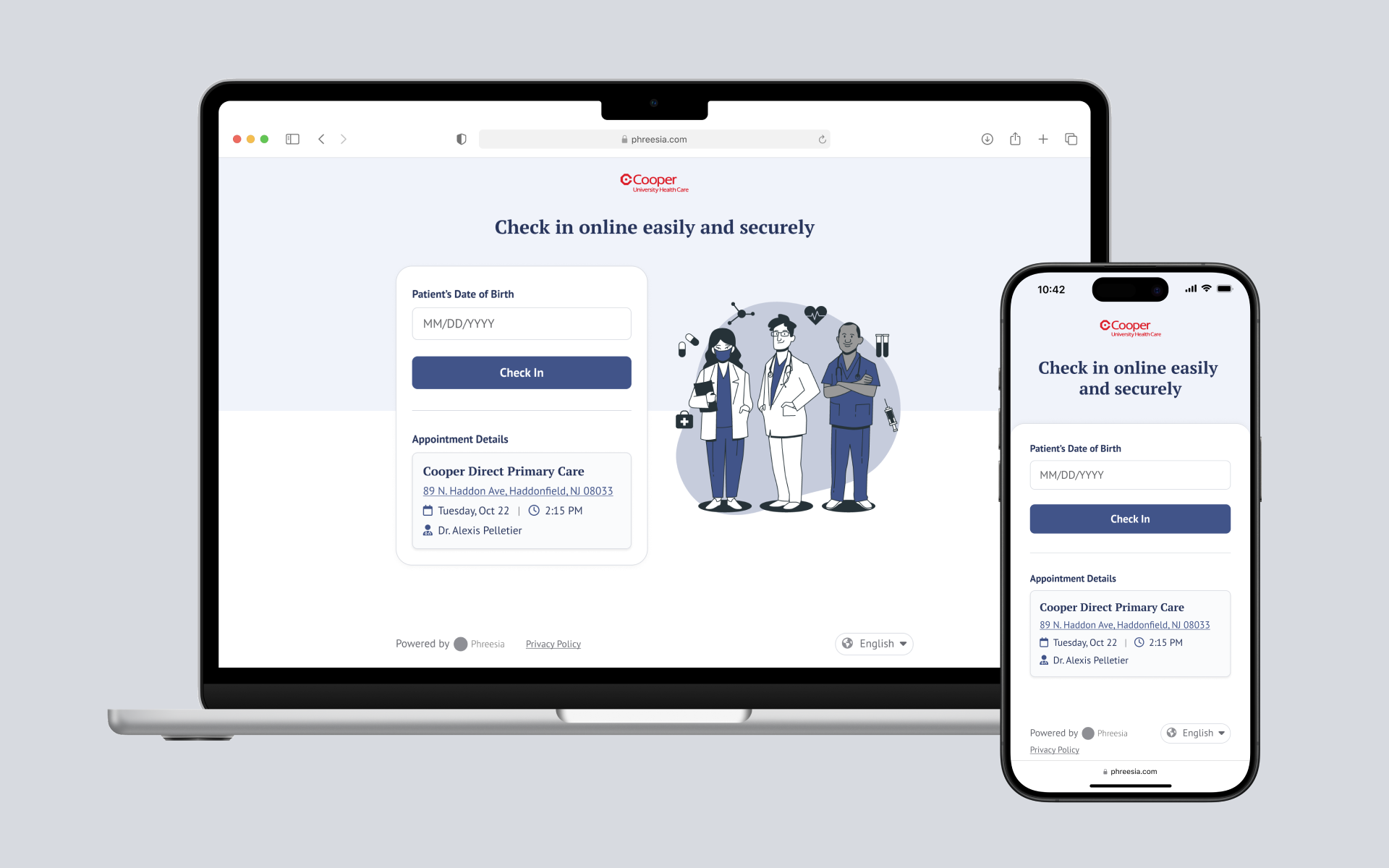
Since 2005, Phreesia's online check-in platform has revolutionized the traditional patient registration process for doctor's offices by allowing patients to complete their check-in online, eliminating the need to fill out repetitive paper forms in the waiting room.
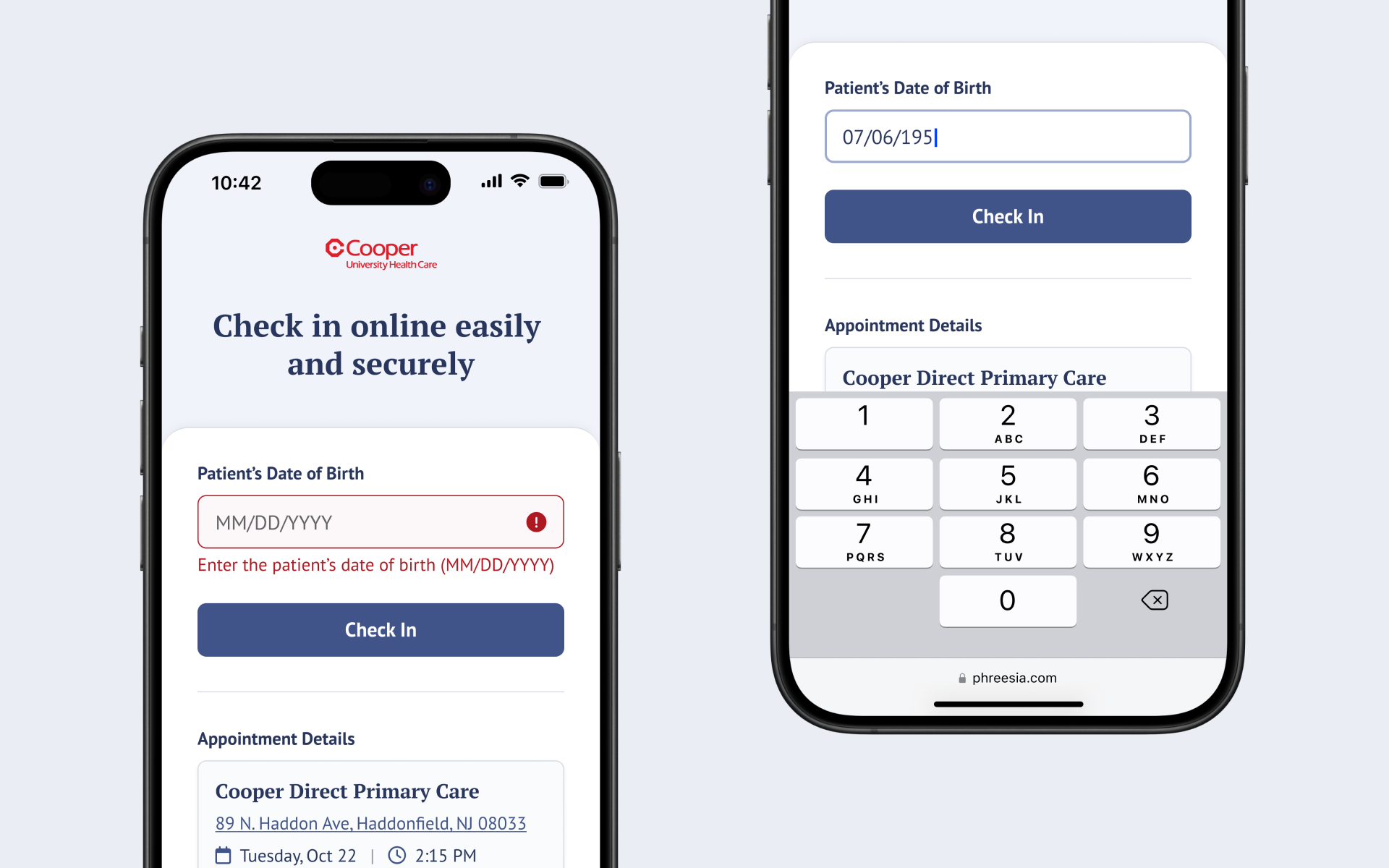
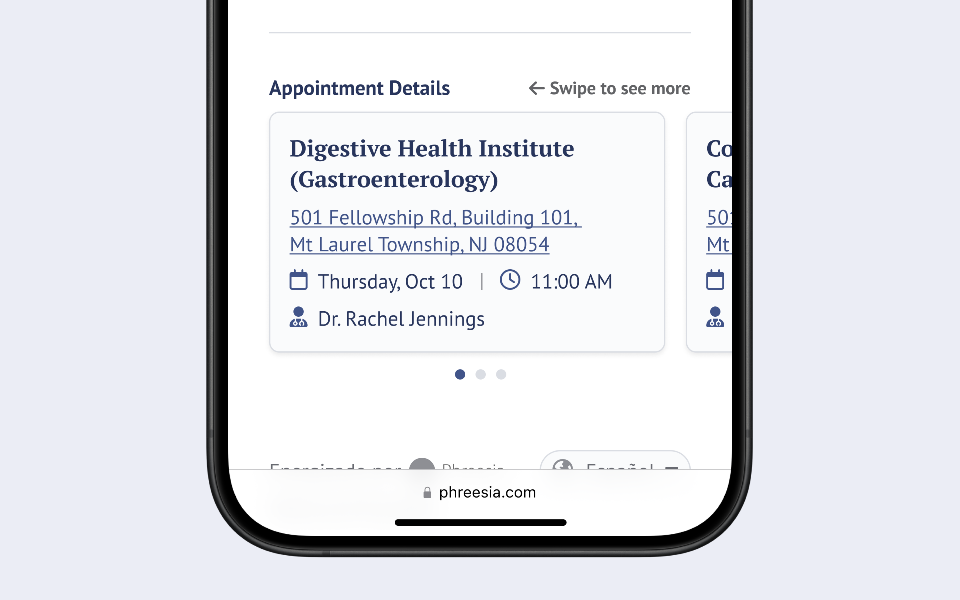
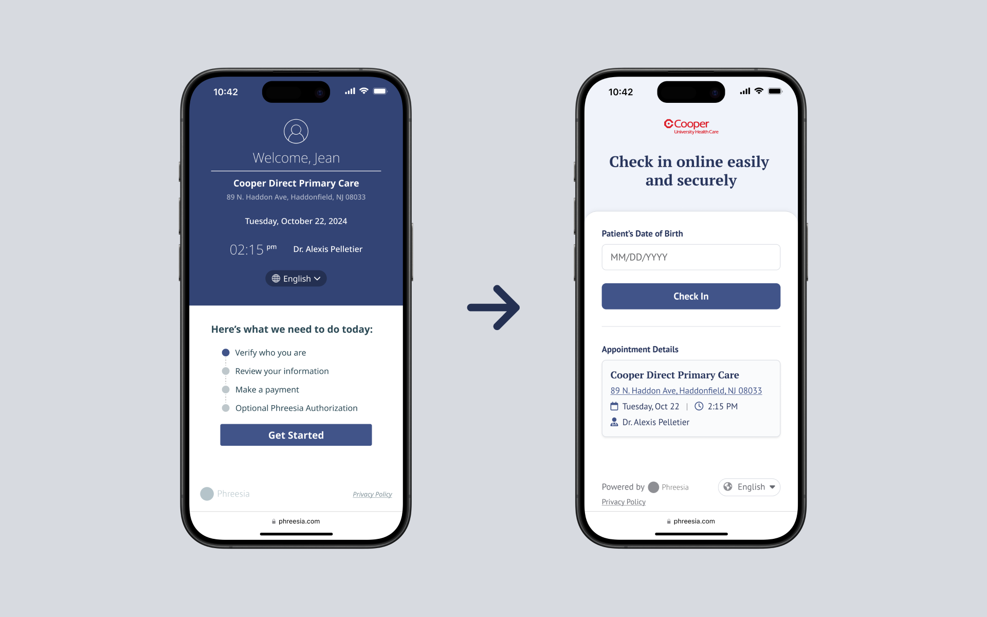
Phreesia's patient intake website was designed to streamline the check-in process for medical appointments. Despite its intended convenience, the initial landing page experienced a significant drop-off rate, with many patients abandoning the process before taking any action. The reason for this high drop-off rate was unclear, posing a critical challenge for the team. Identifying and addressing the underlying issues was essential to improving the user experience and ensuring the website effectively served its purpose.
We needed to uncover why patients were leaving the page without completing the check-in process. This meant diving deep into user behavior, analyzing patterns, and seeking direct feedback from patients. Our goal was to pinpoint the exact moments of friction or confusion that caused users to abandon the process. Understanding these pain points was crucial to crafting a solution that addressed their needs effectively.
Over the course of eight months, I:
For a more comprehensive explanation of each activity, check out my blog: Refining First Impressions
After several rounds of A/B testing and implementing the optimal design, we observed significant improvements:
.png)
One of the most valuable lessons I learned during this project was the importance of deciding when to conduct an A/B test and when to rely on other research methods. Initially, we considered using A/B tests to add and remove elements on the page that we suspected were the cause of the drop-off. However, we soon realized that A/B testing would not provide the deep insights we needed to understand the root causes of the problem.
Instead, I learned that A/B testing is most effective when comparing two variations of a specific element to determine which performs better. It's a powerful tool for optimizing known issues or refining design choices. However, when the underlying reasons for user behavior are unclear, as they were in our case, qualitative research methods such as user interviews, usability testing, and heuristic evaluations are more appropriate. These approaches allowed us to gather rich, contextual insights directly from patients, revealing the pain points and frustrations that led to the drop-offs.