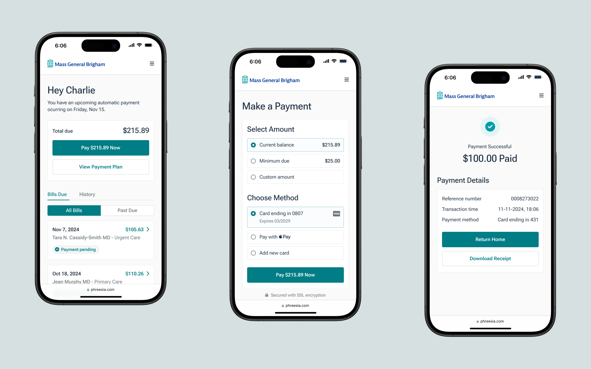
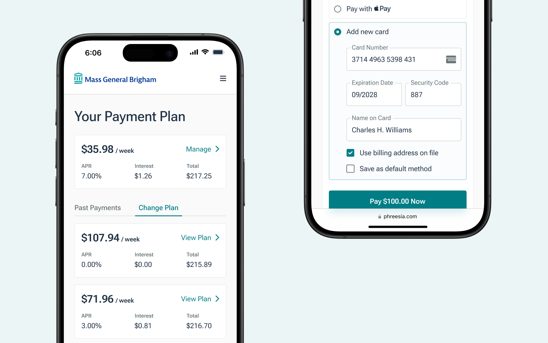
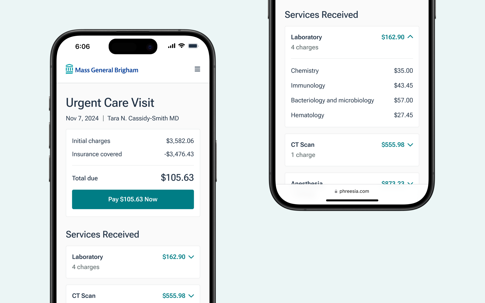
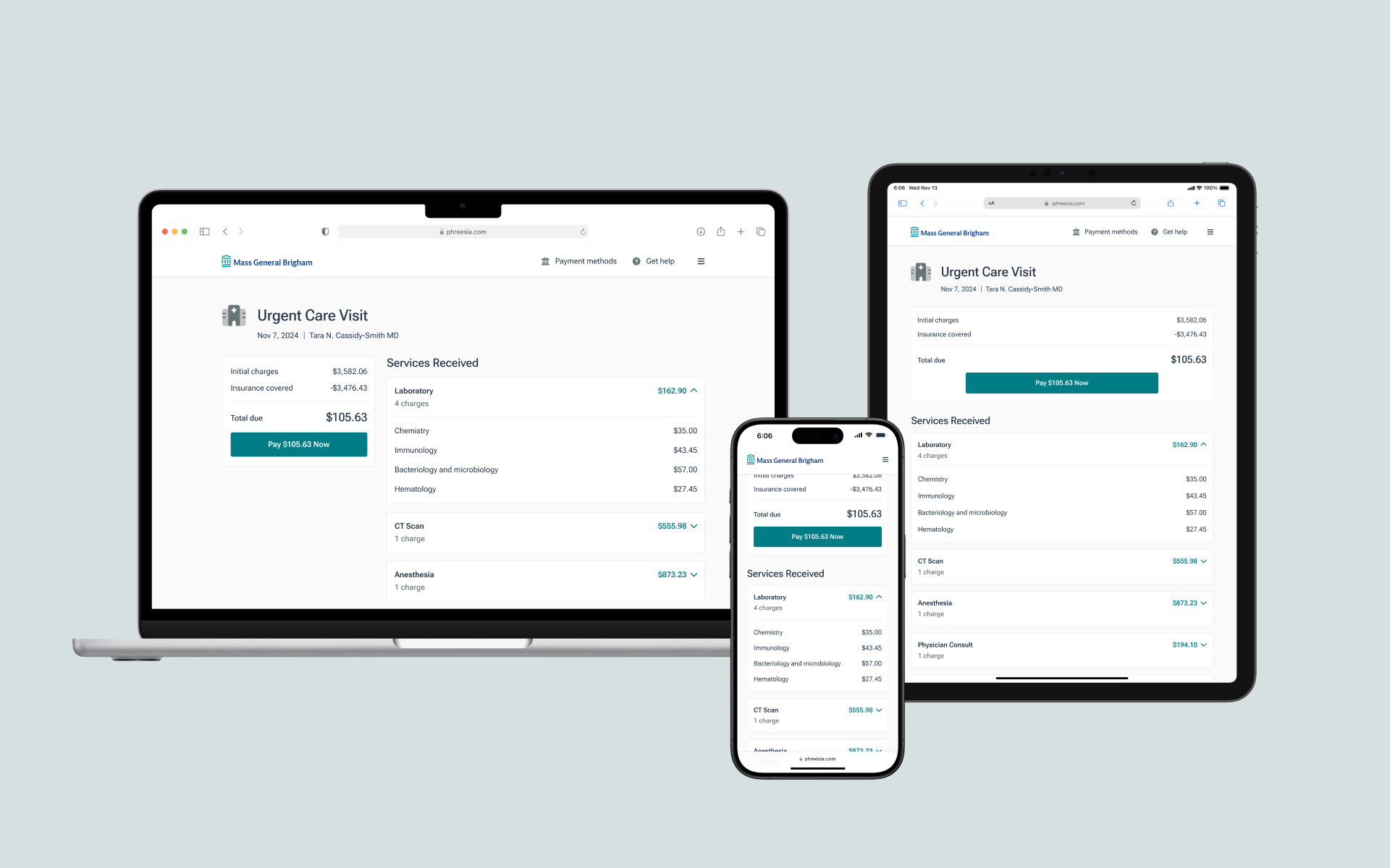
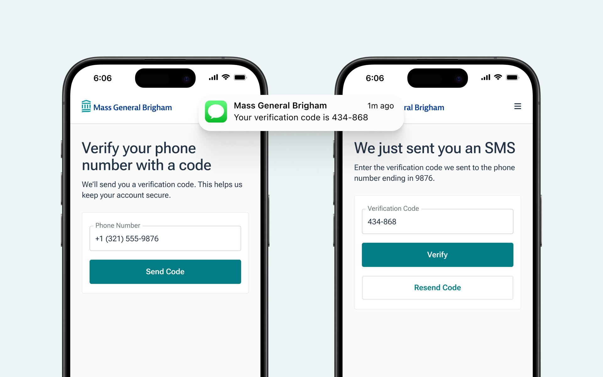
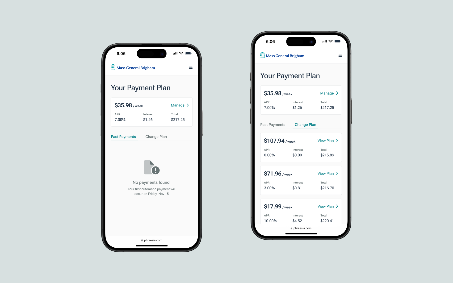
Bill Pay is a platform that allows patients to conveniently make payments for healthcare services online, streamlining the payment process and enhancing the overall patient experience.
In the rapidly evolving financial technology landscape, our company faced a pressing issue: multiple outdated payment products were causing friction for both users and internal teams. Each product had its own interface, workflow, and user experience, leading to confusion, inefficiencies, and a fragmented user journey. Patients struggled with inconsistent features, clunky interfaces, and a lack of integration, while healthcare providers and our internal support teams were overwhelmed with redundant queries and troubleshooting.
Recognizing the urgent need for modernization, my team set out to design a single, consolidated payments product that would seamlessly integrate the functionalities of the old systems. The goal was ambitious: create a user-friendly, intuitive interface that would not only meet the diverse needs of our users but also streamline operations and reduce the burden on providers and our support teams.
Over the course of six months, I:
For a more comprehensive explanation of each activity, check out my blog: From Insights to Interface
We overhauled several key aspects of the payment process, resulting in:
After launching the new payment product through a beta program with 15 clients, we observed:
One of the key lessons from project was the critical importance of clear communication between design and development teams. During the implementation phase, we encountered a slight miscommunication: the developers opted to use a pre-built React library for the UI components, which did not align with the visual language of the design I had handed over. This decision resulted in a slightly disjointed user experience that deviated from our initial cohesive and polished look.
In hindsight, this highlighted the necessity for detailed design documentation and regular check-ins throughout the development process. It also underscored the value of fostering an environment where both designers and developers feel empowered to raise concerns and collaborate closely to ensure the final product faithfully adheres to the original design vision.